Data Visualization 101: Bar Charts Suck
We do a lot of data visualization in the fundraising world. Bar charts are stock in trade, built into every off the shelf product out there. We use them and I hate them. Why?
This comparison courtesy of a company called 3iap and a study they ran with academics nails the issues with the good ol’ bar chart. For starters, I suppose 4 averages are better than one as all averages hide a lot and are often misleading. But, breaking the overall average into 4 as the chart on the left does hardly corrects for all the built-in bias.
And a picture being worth a thousand words is only, wait for it, that’s right, an average. I’d say the chart on the left is maybe 250 words and the one on the right is 10x that.
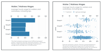
Here are the issues with the bar chart compared to the Jitter Plots (right).
- The bar chart has zero uncertainty built into it – i.e. spread and variance around the mean is missing. The Jitter Plot shows that there are differences within each bar.
- Bar charts are asymmetric and have a within bar bias because all the “ink” is between 0 and the average. This bias means people assume everybody lives to the left of the end of the bar. The Jitter plots are symmetric showing the full distribution around the mean, vertical bar.
- Bar charts don’t communicate sample size, the Jitter plot does.
Why does this matter? People draw a lot of mistaken inferences from visuals that hide stuff. In experiments people were more likely to think Group C people in the bar were lazier than the exact same Group C people shown in the Jitter plot.
Why? The certainty of the bar chart conveys a sameness of the people living in that bar and that sameness makes folks more likely to think the difference in outcome is on them.
Realize there was no context given here, just showing two charts with the titles and axis labeling you see. It’s impossible to know if the outcome differences are structural (e.g. Group C and B work in fast food diners and the other two bars work in higher end restaurants) or people specific.
But, the picture starts to tell a story instantly and we fill in the gaps, often ignorantly.
Kevin
Behavioral Science Q & A
Integrating an individual giving appeal with other communications from a charity can have both positive and negative effects, and the outcome largely depends on how it’s executed. Advantages of Integration Brand Consistency: Maintaining a consistent appearance and messaging across all communications can reinforce the org’s brand identity and strengthen brand recognition and trust among your […]
Read Full Answer
I’m not aware of any in-market tests specifically comparing recurring vs. gift frequency language. I suspect the answer might not be the same with all gift frequencies, nor with all people. It sounds like a great opportunity for you to test and find out what works for your audience. Based on the literature, here’s a couple […]
Read Full Answer
Based on what we know from existing data, those renewal notices can actually be pretty effective in getting people to donate. They tap into our psychology – creating a sense of urgency, reminding us of past support, and using personalization to make the message hit home. They’re playing on our natural tendencies to feel obligated […]
Read Full Answer
Interesting question. I had a quick look at the testing done on this topic. On the positive side, in all cases, over half of donors decide to cover the fee. In some cases, it goes as high as 65%. Not a negligible percentage at all. Here’s another test from iRaiser showing consistent results (see point […]
Read Full Answer
There’s just one thing to consider when designing a supporter journey: the supporter. More specifically, you need to take into account: Who the supporter is i.e. their identity, which is the reason they support this cause, and their personality, which describes the way they “see” and process the world. These will determine the kind of […]
Read Full Answer
I’m not an expert in this but a quick search surfaced this article on the effect of tax reforms on 2019’s charitable giving. The researchers didn’t find a reduction. Actually, they observed an “increase in charitable contributions in 2019, even with the lower tax rates and the dramatically smaller number of taxpayers who itemize their […]
Read Full Answer