Flattening the Curve?
I write this post with caution, certainly not to claim definitiveness nor interest in debating epidemiological models.
Rather, given the saturated splashing of raw counts and pandemic models absent any detail or context on television, online and in the newspapers serves as a poignant reminder of the why an understanding of the purpose and use of numbers, metrics and models is important in both our daily lives and in our work as fundraisers.
Sadly, the epidemiological models have been grossly mischaracterized and misunderstood by most of the press, most politicians and a good part of public. Most believe these models represent attempts at prediction rather than as a managerial, scenario planning tool for which they are intended.
With that said, here goes.
Below is a chart (source data is worldometers) showing the daily growth rate of cumulative Covid-19 cases. Does this matter? In a word, yes. But don’t take our word for it;
“The ‘magic number’ to be monitored is the percentage increase in total cases compared to the previous day. [When it] reaches 0%, there are no more new cases,” says Nino Cartabellotta, the president of the GIMBE Foundation, an Italian healthcare research and training organization and is taken from an April 2nd article in Time Magazine.
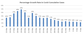
Italy has gone from a daily 12.6% increase between March 16 and 17 to a 4.5% increase from March 31 to April 1. At a certain point, which Italy has reached, this reduction in total case growth rate translates to an absolute reduction in new cases.
The US is not there yet, each day brings a new “high” to the daily total of absolute cases. But, we are close. For example, if the percentage increase for April 5 was 11%, the count of absolute new cases would dip, by one, below the prior day. So, the US is trending in the right direction and it is a sign of curve flattening, if only compared to itself, in that the number of days that it takes to double the case count has shrunk dramatically. We should also underscore that this chart and trendline is not the same as the more ubiquitous charts showing the distribution of total cases, which often resemble a normal distribution (with different peaks) and different skews in tail size. That chart is still ticking up.
It is also worth noting that an increase in the number of days to hit a doubling of cases would happen even if we did nothing. It is the natural evolution of any virus as the number of infected persons goes up (exponentially) and as the number of new hosts goes down and the reproduction rate (R) falls below 1 – i.e. each new infected person infects less than one additional person.
Has the US flattened the curve against some hypothetical worst-case model? Yes, but only if the model of worst case was accurate.
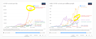
It’s further worth noting that the drop in growth rate is not likely a function of the testing situation. The number of tests per day has gone up dramatically as the growth rate has declined (left chart). The per capita test rate (right chart) is the most useful, responsible way to compare across countries but even then, the comparisons require context. Yes, the US is (finally) doing more testing per capita than other countries (highlighted in yellow on right side) but several of those other countries such as South Korea and Italy are further along in their curve and require less testing.
At any rate, the main point is that the declining growth rate seems real and not a function of sporadic or declining or flat testing rates save for the bit of up and down testing counts (left side) highlighted in yellow.
Standardizing the data to look at percentages and per capita is the only way to understand trends and comparisons. However, absolute numbers are what—especially and most importantly—hospitals experience. A 13% growth rate is better than 25% but it is still a lot of people each day (given the high base) and most importantly, the cases are not evenly distributed across the country so the situation is either exacerbated or lessened pretty dramatically depending on local circumstance.
Finally, a word about the most tragic part of this: the death rate. This will go up in absolute numbers and on a percentage basis for quite some time, even as the growth rate of cases goes down. Why? Because the number of people with Covid-19 still goes up as does the number of people who have hit the period that represents the average number of days between becoming infected and dying. This is the tragic reality of any disease.
On Wednesday the Agitator will return to our principal topics involving fundraising. But for today and while this disease and the models created around it are fresh on folks’ minds we thought it helpful to remind each other that data and metrics have no point of view. There will always be messy data if it involves social science and human beings and understanding the mess is useful but suggesting we can’t operate with messy data or use it is to deny reality because we do it every single day, whether it is business as usual or in the middle of a pandemic.
The aim is to not intentionally (or unintentionally) misrepresent or misunderstand a situation even while perfect understanding is impossible. Much of the total count data being tracked and reported in combination with the fleeting, incomplete reference to modeled “predictions” is, at best, unhelpful. And that is putting it kindly.
Stay safe. Be well.
Kevin
P.S. Update: The US just hit a major milestone, will see if it holds. I wrote in the post that we’d see a drop in absolute # of new cases if the growth rate for yesterday (April 5) was 11%. It was 8% growth, resulting in a 26% reduction in new case count from april 4 to april 5. 34,196 new cases on 4th and 25,316 new cases on 5th.
One response to “Flattening the Curve?”
Behavioral Science Q & A
Integrating an individual giving appeal with other communications from a charity can have both positive and negative effects, and the outcome largely depends on how it’s executed. Advantages of Integration Brand Consistency: Maintaining a consistent appearance and messaging across all communications can reinforce the org’s brand identity and strengthen brand recognition and trust among your […]
Read Full Answer
I’m not aware of any in-market tests specifically comparing recurring vs. gift frequency language. I suspect the answer might not be the same with all gift frequencies, nor with all people. It sounds like a great opportunity for you to test and find out what works for your audience. Based on the literature, here’s a couple […]
Read Full Answer
Based on what we know from existing data, those renewal notices can actually be pretty effective in getting people to donate. They tap into our psychology – creating a sense of urgency, reminding us of past support, and using personalization to make the message hit home. They’re playing on our natural tendencies to feel obligated […]
Read Full Answer
Interesting question. I had a quick look at the testing done on this topic. On the positive side, in all cases, over half of donors decide to cover the fee. In some cases, it goes as high as 65%. Not a negligible percentage at all. Here’s another test from iRaiser showing consistent results (see point […]
Read Full Answer
There’s just one thing to consider when designing a supporter journey: the supporter. More specifically, you need to take into account: Who the supporter is i.e. their identity, which is the reason they support this cause, and their personality, which describes the way they “see” and process the world. These will determine the kind of […]
Read Full Answer
I’m not an expert in this but a quick search surfaced this article on the effect of tax reforms on 2019’s charitable giving. The researchers didn’t find a reduction. Actually, they observed an “increase in charitable contributions in 2019, even with the lower tax rates and the dramatically smaller number of taxpayers who itemize their […]
Read Full Answer
John Burn-Murdoch at the Financial Times is the go-to on stats and trends, commenting too on different responses, lock-down moments, and their impact. He also explains why per capita metrics aren’t useful in this context, as there are localised epicentres. Live stats updates on global numbers here https://www.ft.com/content/a26fbf7e-48f8-11ea-aeb3-955839e06441
And his daily update of charts on Twitter, here. https://twitter.com/jburnmurdoch/status/1246903584819761152?s=21
Stay safe, stay home, save lives!