BRANDING: What Happens After Your Rebranding?
Thanks to Agitators around the world for a great discussion on branding last week from Roger’s post and mine. For those looking at a potential rebrand, check out how to attack it with donor focus and what the likely financial impact will be (short answer: not good).
When you stack up all this evidence, your opponents who want to rebrand for rebranding sake will point to the for-profit world. Look at all that rebranding out there! Look at IHOP becoming IHOB, then IHOP again! Look: there are even articles that talk about the top 16 logo changes of 2018, including Dunkin’ (formerly Dunkin’ Donuts), WW (formerly Weight Watchers), and Uber (whose 2016 logo change apparently didn’t take).
But how long does it take for a logo redesign to conquer the zeitgeist?
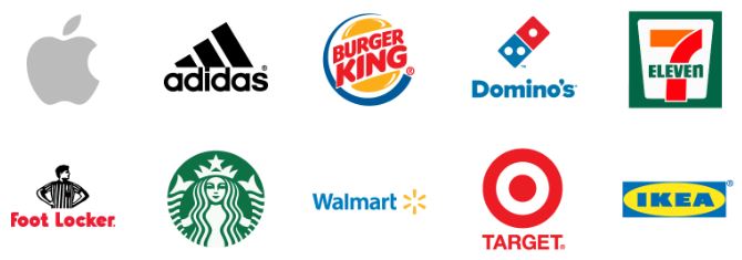
Signs.com looked at recall of logos from ten well-known global brands: Adidas, Apple, Burger King, Domino’s, Foot Locker, Ikea, 7-Eleven, Starbucks, Target, and Walmart. I am literally writing this while listening to an iPod on headphones I got at either Target or Walmart with my feet up on an Ikea table so I’ll argue this is a pretty good list of brands. They asked participants to draw these logos from memory.
Before we go on, picture each of these logos in your mind. (If you want Agitator Bonus Points, redeemable at none of the nation’s finest retailers, you can even draw them yourself.)
OK, first the fun stuff. There are some standard mistakes that are common, sometimes even a majority opinion:
- 31% of people think the Apple apple has a stalk
- 21% think the Burger King logo has a crown
- 55% did not put an apostrophe in Domino’s
- 59% didn’t put a green border around the 7-Eleven logo
- 43% didn’t have a referee in the Foot Locker logo
- 55% forgot the Starbucks Melusine (not technically a mermaid or a siren because it has a serpentine split tail) had a tail; 45% forgot her crown
- 41% drew the wrong number of circles in the Target target
To be clear, I’m not making fun of these folks – I did three of these things in my drawings.
But what was more interesting for our purposes was the percentage of people who used a company’s old logo:
- 3% used Apple’s rainbow-colored logo (circa 1977-1998) and another 3% used its blue logo from 2002-2007.
- 12% used Adidas’s trefoil logo that stopped being its primary logo in 1997 (it is still used on some products).
- 21% used Burger King’s logo without the surrounding blue circle, which it used in two different forms from 1969 to 1999.
- 15% used the square Domino’s logo used from 1996 to 2012.
- 31% used the Starbucks logo with the name written around the outside of the Melusine used in two forms from 1987 to 2011.
- 21% wrote the Target name in black as on their 1975-2004 logo.
- 7% used the old (1992-2008) Walmart logo and another 11% mashed up the old logo and the new logo.
The usual narrative of a logo relaunch for a brand is that it will take a while to use down all of the old materials with the old logo. Then, we’ll all standardize on the new logo and pretty soon everyone will know us by our new mark.
The evidence, though, is:
- Given a Target-sized, Walmart-sized, Starbucks-sized, or Burger-King-sized (Whopper-sized?) marketing budget…
- And a decade or two…
- You’ll get about 80% of the way there.
This variety isn’t necessarily a bad thing. In fact, we advocate people play with their logo (e.g., Google) and allow supporters to play with their logo to help with fundraising. The logo isn’t sacred. But given that, why spend the money, time, and effort to change it?
In the end, the best recall of all logos among Americans was a Swedish company: Ikea. One reason for this is likely that it is has had the same logo since 1983. Perhaps you should as well.
Nick
P.S. Here are the ten current logos; how did you do?
2 responses to “BRANDING: What Happens After Your Rebranding?”
Behavioral Science Q & A
Thanks so much for raising this. Yes, capturing donor information can be helpful for stewardship like newsletters, thank-you letters, impact updates. But how you ask matters. Forcing full data capture introduces friction that can significantly depress conversion, many donors may simply abandon the process. Beyond the friction itself, required fields also shift the emotional experience […]
Read Full Answer
Unlike holidays that everyone already knows, Giving Tuesday is a created event. Many donors recognize the name but not the exact timing, so referencing it becomes a helpful cue. It serves as a reminder and taps into social norm activation (“everyone’s giving today”), which boosts response. However, we still want it paired with the mission, […]
Read Full Answer
When a subject line leads with the match (“Your gift matched!”), it risks triggering market-norm thinking: the sense that giving is a financial transaction rather than an act rooted in values, identity, and care. This shift reduces intrinsic motivation and, over time, can weaken donor satisfaction and long-term engagement. It also makes the email indistinguishable […]
Read Full Answer
There’s no evidence that QR codes suppress mid-value giving; all available research suggests they either help or have no negative effect. In fact, behavioral and usability research consistently shows the opposite: reducing friction at any point in the donation process increases completion rates and total response. And that has nothing to do with capacity and […]
Read Full Answer
What you’re experiencing is very common. Resistance often isn’t about capability, but about motivation quality. If board members feel pushed into fundraising, that triggers controlled motivation (low quality motivation) i.e. obligation, guilt, or fear of judgment, which often results in avoidance. Instead, we need to create conditions for volitional motivation (high quality motivation) by satisfying […]
Read Full Answer
That’s a really thoughtful question, and you’re not the first to raise it. Many of our clients have been cautious about placing the ask at the very end. To address their concern, we’ve tested both approaches, and the results are clear: when the ask comes last, even if that means it appears on the second […]
Read Full Answer
Why would it matter if someone drew the logo correctly? Isn’t what matters that they recognize it and what it stands for? Wouldn’t the important test be what the logo stands for in the consumer’s mind and how that matches with the company’s brand promise?
And, as we all know, the logo is not the brand.
Exactly – nonprofits are often making changes to logos assuming they will mean something. One we talked about a couple weeks ago (http://agitator.thedonorvoice.com/branding-who-polices-the-brand-police/) spent time, effort, and treasure to go from a three-color logo to a seven-color gradient (that looked nice online, but was unprintable). People won’t really notice — some of them will think of you by the logo you had 20 years ago. To the extent that they notice, it won’t generally matter because the important part is the brand, not the logo. Thus, logo reshuffling isn’t terribly helpful, but is terribly expensive.