Fitts Law and Your Donor’s Mouse (or Finger)
August 21, 2023
Kevin Schulman, Founder, DonorVoice and DVCanvass
Paul Fitts, a psychologist from the 50’s realized many errors attributed to human fallacy were, in fact, due to poor design.
His studies led to Fitts’s Law, which states that the time it takes to move to a target (like a donation button) depends on the target’s size and its distance from the starting point.
T = a +b (log 2 2D/W)
The formula may look wonky but it’s pretty simple.
- D = distance I have to move my finger or mouse and so, closer is better
- w = the width of the target (e.g., button) and wider (or taller if that’s the smaller of the two dimensions) is better.
The logarithmic nature means the time it takes doesn’t grow linearly. If I double the distance between the mouse and the button it doesn’t take twice as long to get there.
That’s because we tend to move quickly at first and then slow down to make sure we hit the target.
What’s this mean for UX design? Here are few implications,
- Small is bad.
- Touch Interaction (e.g., Smartphone or Tablet):
- Human Finger Size: The average width of an adult human fingertip is about 10-14mm.
- Recommended Button Size: To accommodate the average fingertip and ensure comfortable touch interaction, many design guidelines, including Apple’s Human Interface Guidelines and Google’s Material Design, recommend a minimum touch target size of 44×44 pixels on mobile devices.
- Mouse-based Interaction (e.g., Desktop Computer):
- Mouse Pointer Size: The precise size of a mouse pointer can vary based on the user’s settings and the OS, but it’s typically much smaller than a fingertip. The tip of the standard arrow pointer is the active point, allowing for precise interaction.
- Recommended Button Size: For desktop interfaces, buttons can be smaller than on mobile. A common minimum size is 32×32 pixels, but many desktop buttons, especially those in toolbars or menus, can be smaller, around 16×16 pixels. However, for primary actions or CTAs (Call to Actions), it’s still beneficial to have larger buttons to draw attention and ensure easy clickability
- Touch Interaction (e.g., Smartphone or Tablet):
- Add labels to your icons. Firstly, most icons aren’t nearly as ubiquitous in meaning as you think. QR codes on direct mail, for instance, benefit from more instruction on what to do and why. Plus, adding a label to your icon makes it bigger.
- Padding the target isn’t enough. Most people don’t realize the padding is there and therefore slow down at the same rate as if it weren’t – and time kills deals.
- Size matters but so does spacing. Lists of links and stacks of buttons tend to fall prey to touch target errors because even if each button is above the minimum there isn’t enough room between the buttons (or links)
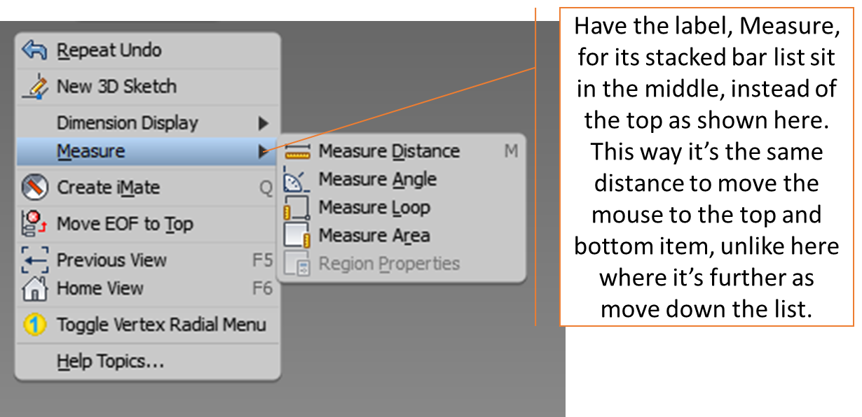
- Go for the middle. Have the menu label, Measure in this example, sit in the middle of the expanded, vertical stacked menu to make mouse movement to the top and bottom item equidistant.

Kevin


Jaw officially dropped