How You Can Tell the Truth With Data
Monday, we talked about how other people lie. Here’s how you can tell the truth – effectively.
It’s the last part that’s important. Anyone can present data honestly. But giant wads of data aren’t compelling.
This is problematic because there is a war going on. It’s between two types of marketing people: art versus science. The art folks appreciate the aesthetics of marketing and aim toward beautiful design and copy. They will talk about white space and the golden ratio and L-shaped copy and such. They elevate fad into trend into fashion. They were responsible for the Apple “1984” commercial and don’t understand the why-it-didn’t-move-the-needle problem. And they don’t understand why the guy with a bad toupee on late night commercials is successful. They can read the nine-point font they are proposing for your Website and don’t care if others can.
The job of us science people is to make sure the art people don’t damage your organization too much.* Our motto is “Beauty is beautiful, but what else does it do?”, or it would be if we started having mottos. Our tools are the well-designed study, the impertinent question (e.g., “I understand that our brand guidelines say to use the Garamond font, but our testing shows Baskerville converts better. Would we rather stick to the brand guidelines or raise more money?”)
The only times the art marketing people win (or should win) is when science people don’t explain well. Say what you want about the art folks, and I do, but their PowerPoint slides are pretty. We don’t need to go full design school, but we need to apply a scientific eye to how people learn. And that is:
Stories with pictures
Yes, really. The human brain craves narrative and will put a story to about anything that comes in front of it. It also retains images better than anything else. There’s a semi-famous experiment where they gave noted oenologists ( “wine snobs”)*** white wine with red food coloring. The experts used all the words that one uses to describe red wine, without ever noting that it was actually a white wine. When confronted with this, the so-called wine experts all resigned their posts and took up the study of nonprofit direct marketing to do something useful with their lives.

OK, I’m lying about that last part.
My point is that we privilege our sight over all other senses – in essence, we are all visual learners. When we see words on a slide, our brain, which is still trying to figure out why it isn’t hunting mastodons, sees the letters and must pause to think “what’s with all of those defective pictures.”
So, step one is to have assembled all your data and determine what story you are going to tell. Step two is to break it into a logic flow and muster your forces. Let’s look at an example using a direct marketing story:
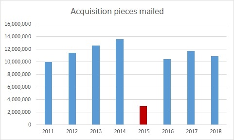
“The idiot I replaced cut acquisition mailings in 2015.”
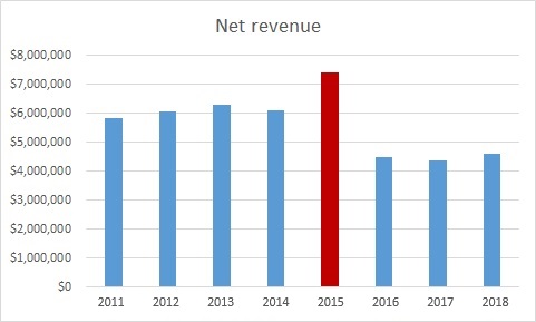
“It spiked net revenue for a time, enough for him to find another job.”
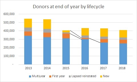
“But that has really screwed us out of multiyear donors coming into 2018. You can see the big drop in multiyear donors in 2017 because they weren’t acquired two years earlier. This is what I call the saggy mattress problem.’
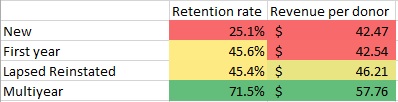
‘And multiyear donors are our best donors. You’ll also note that our lapsed reacquired donors have greater yearly value than newly acquired with about the same retention rate. Thus, my first strategic priority is to focus more on reacquiring lapsed donors. They aren’t as good as the multiyear donor that idiot made sure we didn’t have coming into the file this year, but pretty darn good.’
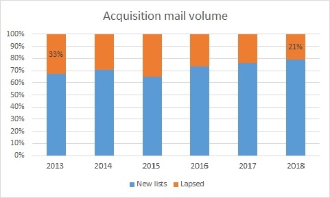
‘Lapsed donors have actually decreased as a portion of our average acquisition mailing…’
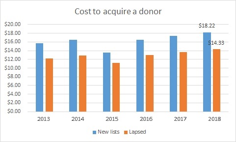
‘…yet they have been cheaper to acquire. In summary, they are better donors than newly acquired donors and they are cheaper to acquire, yet we’ve been reaching out to them less. Thus, we have an opportunity here.’
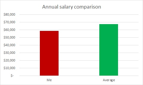
“Because of this insight and because my salary significantly lags the national average for a direct marketing manager of $67,675, I believe I deserve a raise. I’m now open for questions.”
For most organizations or (God help you) agencies, this would be over 30 slides, over an hour long, and still not reach a point. I’ve given some of those presentations; if someone was in one of those and is still reading this, I apologize.
Some key notes from this:
- Note the use of color to draw attention to the areas that are important to you. Other data are there to provide background, but if you are giving the presentation, it is incumbent upon you to guide the mind of your audience. In fact, if you are giving the presentation, you may wish to present the chart/graph/data normally, then have the important colors jump out (or the less important ones fade away), arrows fly in, and text appear.
- As mentioned, this is a different structure of presentation than would normally occur. Normally, there would be a section on file health, then one on revenues, one on strategic priorities, and so on. However, when you structure like that, the slide that makes the point of why you are doing the strategic priorities you are doing may be 50 slides early. You can say, “remember the slide that said X?” but regardless of what the answer is, the answer is really is no. You are smarter than that. You are going to use data to support narrative, not mangle your story to fit an artificial order of data.
- There is one point per image (with the exception of #4, which had a nice segue opportunity) and no bullet points. Bullet points help in Web reading (hence my using them here), but they hurt memory and retention in presentations.
As we mentioned Monday, though, you get better and better at distilling your point, there will be a temptation to take shortcuts and to tilt the presentation so it favors your viewpoint beyond what is warranted. Part of this is ethical, to be sure – don’t be that type of person – but a larger part is that no one person is smarter than everyone else summed together. Even readers of this blog. If you omit or gloss over important data points, you aren’t allowing honest disagreement and insights among your audience that can result in even greater understanding. By creating an army of ill-informed meat puppets, you are going it alone trusting on your knowledge and skill alone to get you through. There will be a day and that day may be soon when the insight you will need will be in someone else’s head.
You do have to prioritize for your audience. You may have noticed some other points you might have covered in these graphs – retention in this program is falling and cost to acquire donors is increasing. This person chose to focus on lapsed but didn’t hide the other metrics, which is sound policy.
Other tips you’d like to share?
Nick
* I am framing this as a battle largely for dramatic purposes. Ideally, you have a data person who respects the talents of a high-quality designer and a designer who likes to focus on what works. These together are stronger than any one alone.**
** But if you must pick one, pick the scientist.
*** Oenology is actually from the Greek words for “wine” and “study of,” but that isn’t funny…
2 responses to “How You Can Tell the Truth With Data”
Behavioral Science Q & A
Whether “help” is more engaging or not really depends on the framing and context. The word help can sometimes weaken the perceived agency of the supporter, making their role feel secondary rather than central (your point). On the other hand, help can also signal collaboration rather than implying full ownership of the outcome, which might […]
Read Full Answer
Great question! Here’s how behavioral science can help unpack what might be happening: Pain of Paying: Even a small extra charge can make giving feel more transactional than emotional, potentially reducing generosity. Fairness Concerns: Some donors might perceive donor cover as a surcharge rather than a contribution to the cause. If they feel the charity […]
Read Full Answer
The choice between “Your gift CAN…” and “Your gift WILL…” taps into the psychological framing of certainty vs. possibility. Currently, there is no academic research directly comparing these two framings in charitable appeals. However, I suspect no framing is universally better—the outcome likely depends on your target audience and the campaign’s goal. Here are some thoughts: Certainty Framing – […]
Read Full Answer
Integrating an individual giving appeal with other communications from a charity can have both positive and negative effects, and the outcome largely depends on how it’s executed. Advantages of Integration Brand Consistency: Maintaining a consistent appearance and messaging across all communications can reinforce the org’s brand identity and strengthen brand recognition and trust among your […]
Read Full Answer
I’m not aware of any in-market tests specifically comparing recurring vs. gift frequency language. I suspect the answer might not be the same with all gift frequencies, nor with all people. It sounds like a great opportunity for you to test and find out what works for your audience. Based on the literature, here’s a couple […]
Read Full Answer
Based on what we know from existing data, those renewal notices can actually be pretty effective in getting people to donate. They tap into our psychology – creating a sense of urgency, reminding us of past support, and using personalization to make the message hit home. They’re playing on our natural tendencies to feel obligated […]
Read Full Answer
Très bien, Nick. Simone
Great article. I can attest that visuals go along way in convincing donors.