Is Brand Color Black and White?
Name a charity logo that’s red. Now think of a blue one. For me, it’s Médecins Sans Frontières (Doctors Without Borders) in the first case and UNICEF in the second. The association is instant. But why? Because logos are like the cover of a book you’re about to judge—it’s branding shorthand, connecting emotions and perceptions to a cause before you’ve even processed what it stands for.
Of course, blue and red are just the opening act. Dive deeper, and the background color of these logos can flip the script entirely. A white background? Your logo says, “I’m approachable and optimistic.” Switch that to black? Now it growls, “Back off”.
The emotional tone of a logo isn’t just about its primary color but the stage it plays on. It’s as if the same actor delivers wildly different performances depending on the lighting. Take a red logo and pair it with a white background, and it screams cheerfulness and liveliness—like a holiday card from Coca-Cola. Slap a black background behind that same red, and suddenly it’s aggressive. Similarly, blue on white exudes calmness and competence, while blue on black risks veering into sadness.
These shifts occur automatically, regardless of whether a brand is well-known or obscure. Whether it’s a globally recognized emblem like UNICEF or the logo of a smaller local nonprofit, the interplay of color and background remains potent.
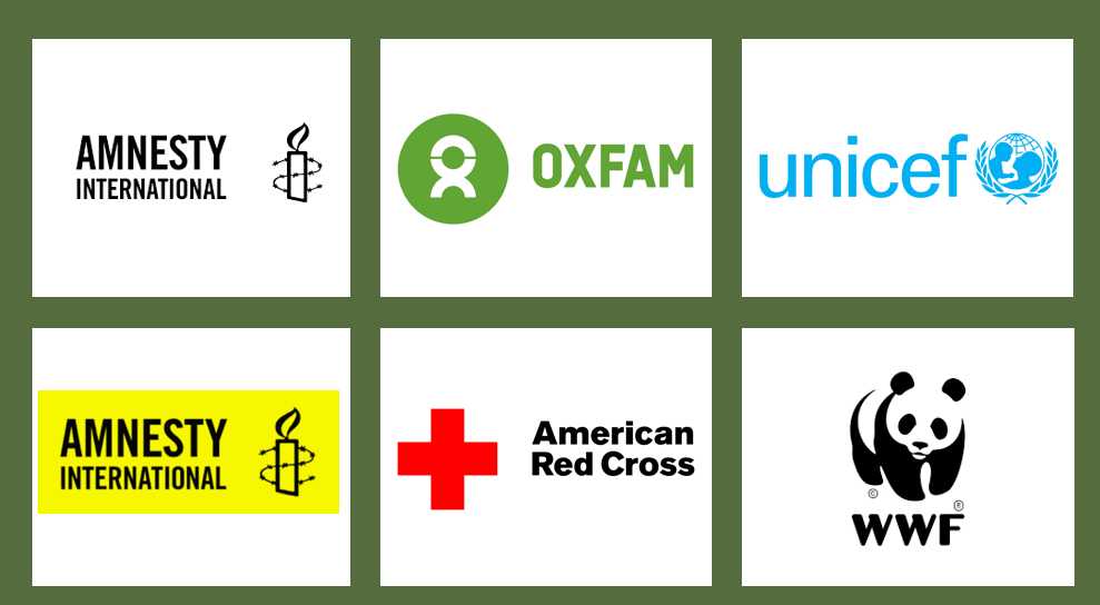
Amnesty International’s black candle logo offers a fascinating case study. In its typical presentation, the black lettering and candle sits in yellow negative space – a design choice that is more crucial than we realize. The yellow backdrop creates a sense of urgency and attention-grabbing warning – think caution signs – which aligns perfectly with their mission highlighting human rights violations.
But when the same black candle appears against white it might read differently. White backgrounds tend to amplify positive associations while diminishing negative ones, potentially softening the logo’s urgent call to action into something more contemplative or hopeful.
Now, not all logos play by the same rules. One key mitigating factor is how meaningful the logo design itself is. A meaningful logo—one that’s realistic or closely tied to a clear concept—can overpower the background effect.
WWF’s iconic panda, being a meaningful and recognizable symbol, maintains its emotional consistency across different backgrounds.
But a more abstract logo like Oxfam’s, and it becomes an emotional shapeshifter, dramatically changing its message depending on its backdrop.
While the WWF panda stands firm like a mountain, abstract logos are more like weather vanes – spinning their message with every change in background
The research offers some counterintuitive findings too. While most charities aim for positive associations, some causes actually benefit from the gravity a black background provides. Organizations fighting against human trafficking or environmental destruction might find that black backgrounds amplify their urgent message – turning their logos from mere symbols into emotional alarm bells.
For fundraisers and nonprofit marketers, this isn’t just academic trivia. It’s about understanding that your logo’s background is actually part of your message. Whether you’re designing donor communications or planning a campaign website, that choice of backdrop is secretly whispering to your supporters’ subconscious.
The bottom line? In the world of charitable giving, where trust and emotional connection are everything, these subtle psychological triggers matter. Your logo’s background isn’t just empty space – it’s an active ingredient in your organization’s emotional recipe. Choose wisely, or you might find your message getting lost in the negative space.
Kevin


