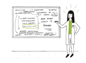
The Charity Sector Data Fishing Plague
Slice your data enough ways and you’ll find differences.
I was reminded of this sitting through a conference session that shall remain nameless to protect the guilty. But they’ve got lots of company.
How many times have you seen a Powerpoint deck from one of the 3rd party data providers summarizing how your donors are different from the general population or how your active donors differ from lapsed? It’s 20 slides of mind numbing data charts showing your donors broken out by all their available data.
Your donors love blue hats, stamp collecting, are a tad less Gen X, tad more Gen Y (whatever that means), are more left-handed and like to use Mastercard slightly more than the average consumer while also buying garden gnomes at an alarmingly high rate.
 You’re guaranteed of four outcomes from all this data fishing:
- You’ll find lots of differences and the correlations increase exponentially
- Almost all of them are random noise
- The data provider and/or someone from your organization or your agency will come up with a story to fit the differences. As evidence, an experiment was run with half of doctors reviewing intentionally manipulated lab results that were the complete opposite of reality and wildly unlikely to boot. Both groups of doctors quickly came up with a story to ‘fit the data’ and both were equally confident in their diagnosis and treatment plan.
- If you make fundraising decisions based on this data it will cost you time and money with no return. Renting the list of stamp collectors for your next mailing because your responders index incredibly high on it is not going to work.
The session I sat through showed how a test mailing beat the control. Ok, great. The agency proceeded to show slide after slide of the test response rate broken out by whatever 3rd party data was available. No differences in gender or age or a myriad of other, random demographics.
But fear not you devoted session attendees, this fishing expedition wasn’t for naught. Geographic differences showed up and not just that more people gave from CA, TX, NY, FL, PA and the 3 next most populous states (we’ve all seen this chart too). No, this was much more interesting and ‘rigorous’; some of the state level skews sort of, kind of matched political state leanings.
Volia. Awesome. Now we get to color code states red or blue and see that a few red states really liked the test.
For every 20 ways you break out data, you can expect to see at least one statistically significant difference that is purely random chance.
What to do about this? I suppose the exhortation to stop it will fall a bit flat. How about charities demanding more of their agency partners, who are the main data fishing ‘gurus’ out there? Ask them if they had a hypothesis about differences they would see and why they’d see them before they started slicing and dicing?
The vast majority of times the (honest) answer will be, “No.” Statistical significance testing is a huge waste of time at best, and likely leads to really bad decision making at worst, if it’s done without a hypothesis upfront, before the data slicing.
I am 99.9% certain the agency doing the “analysis” of their test mail results did not hypothesize, upfront, that the test would do better in (a few but certainly not all) red leaning states. Nor did they hypothesize that it would perform differently by the 87 demographic variables they broke out results by.
It’s not analysis, it’s not insights. It’s called data fishing or dredging and it’s a very big problem.
Here’s the paradox. You don’t want to send the same thing to everybody. That means there are meaningful differences in what people like and are motivated by. But the path to real donor-centricity and building a donor segmentation tied to root cause cannot be found by sending the same thing to everyone and then breaking out the results six ways from Sunday.
The only way is to put in the think time up front, lean on some theory and develop two appeals going to two very different audiences. The targeting is different, the message is different. And both also get the control. If either test beat the control you know why. It’s exactly what your hypothesis predicted. There is comfort akin to a warm bubble bath in a jacuzzi tub from this approach. The chance the difference is random is much smaller.
The chance the state and ideology based differences from the fishing expedition are real? Slim to none.
Kevin


