Think Locally, Act Locally
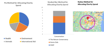
How do people think about and organize their giving? Do people have a favorite charity or two for each sub-sector that matters to them? The pie-chart of giving method?
What about the stacked bar chart method where folks are single-issue oriented and give to 5-7 conservation charities, for example?
I expect most readers would bet on one of these two mental methods for allocating discretionary charitable giving.
Research out of Australia suggests neither of these is the on the mark. Instead, they found evidence for what I’ll call the radius method, draw a circle around oneself on a map and that’s how I give. To be clear, my circle might be the entire country or just my region or even the entire globe.
People seem to prefer and therefore organize their giving around the geographic footprint of charities. I like National groups or more local ones and this preference influences who I give to and don’t.

One of the researchers is a DonorVoice friend and occasional colleague, Cassandra Chapman. You can find the study here.
The researchers looked at giving data from over 1.5 million donors from 52 charities.
First off, 75% of the charities shared donors with all 51 of the other charities. That’s a lot of sharing.
Researchers ran a series of cluster analyzes, which is a statistical method to create segments that are as similar as possible within a given segment and different as possible from other segments. It’s a spatial algorithm, grouping charities (or people) into a virtual space with maximum distance between and minimum within. There is a far bit of subjectivity to this type of analysis and the variables you use and how you use them matter so buyer beware.
None of the clusters grouped together by sub-sector. This means people aren’t giving via the Pie Method, divvying up to varied missions.
There was also only weak support for donors organizing their giving around the beneficiary – e.g. I give to animal groups as my organizing method. No stacked bar charts model here.
Instead, the clustering resulted in charities grouped by geography,
- International
- Regional
- National
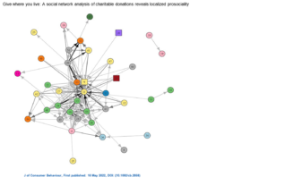
This spatial network analysis is wonky but visually supports what they found. The shapes are called nodes and each node is a charity with further color and shape coding. The lines represent the donor overlap.
- Circle = national or regional
- Square = international
- Node color indicates charity sub‐type:
- Yellow = health
- Green = social services
- Orange = research
- light blue = environment
- Purple = international
- Light pink = animal
- Dark blue = religious
- Red = emergency
- Dark green = sports and recreation
- Bright pink = education
- Gray = mixed sub‐type

One thing is very clear. There are a lot of lines and close groupings for the green circles, which are social service national or regional charities.
The final analysis was predictive and they found no relationship between sub-type or beneficiary and the degree of donor overlap or sharing. But, they did find that geographic footprint of the charity to be a significant predictor of the degree of donor overlap.
This does raise the practical question of list-swapping that tends to heavily focus on a “beneficiary”, stacked bar approach. If you are a veterans group you’ll be served up veteran lists. Conservation group? Here you go, conservation donors. The logic seems solid but the Earth was flat before it wasn’t.
What about a more diversified list swap scheme that at least adds a local/national/international filter to stacked bar methods?
Kevin
P.S. Don’t miss out on our learning session for the Science of Words, your copy and response rates will thank you. Register here.


Darn, I wish i knew this was coming! I literally wrote a piece about geographic giving yesterday for LinkedIn.
One other dataset that could be useful here for folks is what we just added to our donor impact data hub. It’s an interactive map that shows how donors who live in certain states give. We added filters for mission and it shows how many donors and aggregates for online vs offline.
But it was also very much version 1 of what we want to do so I want to look at these resources to get some inspiration. As always thank you!
https://neonone.com/resources/nonprofit-impact-trends-data-hub/
What do you mean when you write, “75% of the charities shared donors with all 51 of the other charities”?
Are you saying a donor supports many of the charities?
Are you saying the nonprofit shares their donor file with other nonprofits?
Something different?
I apologize, but that sentence isn’t clear to me.
Hi Chris,
That sentence means that if a charity matches its donor file to the 51 other charities they’d have donor overlap (i.e. matches) with all 51. And this applies to 3 out of 4 charities.
Kevin
Hahaha, I was literally just about to ask if you and Tim Sarrantonio were coordinating… but of course Tim’s already here. 🙂
I’ve discussed the decision making process with a few donors. It helps a fundraiser if they can imagine how it is accomplished. This is typical… they get a lot of mail and email ! They set aside their direct mail, on a given day they review it all, stack it in piles, by amount to donate, e.g. $25, $50, $100, look at websites and annual reports and decide who they continue to support and who they might add and what pile they will be in. Then they get out the cheque book or credit card and donate. It’s time dedicated to their service of philanthropy. This could explain why digital donations are still less than 10% according to Blackbaud.
Fascinating. I was surprised though that education has not shown up because for most charities in Australia for which i have had geodemographic research done, (which is many) education has been the key distinguishing characteristic.