Walk A Mile In Their Shoes
I’m surprised when the online donation form companies give me a deer in the headlights look when I ask whether they do user experience research. I should stop being surprised as this has happened many times. I’m a slow learner.
The charity sector average conversion rate of human beings on donate forms is 12%. That’s an 88% failure rate among people who made a purposeful choice to be on the flipping page.
You can torture the behavior data all you want, it will never surrender the answer on why people exit without finishing because it doesn’t know. Enter user experience research, you know, ask em’. I’ve done a fair bit of UX research over the years and it never fails to reveal use cases that you’d never dream up.
For example, discovering lots of people print out their digital confirmation web page. If you’ve never done this because you’ve never thought of it, you’re excused. But depending on how much “tops and tails” stuff you have on the page, it can spill out to multiple pieces of printed paper. Take it from me, people hate that.
It seems the latest user experience fashion trend for web checkout is a multi-step process. Behavioral science rationale might endorse this because,
- Chunking out the steps so no single step seems daunting with lots of fields
- while simultaneously showing a progress bar (e.g. 1 of 3 steps) removes ambiguity
- and once step one is done our completion bias kicks in and we want to finish
It seems behavioral science is very likely wrong as many head to head tests I’ve seen show the single form page converting better. But, those multi-step forms often look pretty with modern day design aesthetics. If only those pesky humans would stop getting in the way of a pretty process.
We aren’t alone in charity world. The commercial sector is replete with user experience failures that could have been avoided if only somebody dared to walk a mile in the user’s shoes.
- Google Meet: For a long time, it had counterintuitive mic and camera toggle buttons, with users frequently confused about whether they were on or off. The buttons would turn red to signify muting, but many users mistakenly thought red indicated the mic was active.
- Hulu’s Unusable App Tab: Hulu once included a tab in their app to manage subscriptions, but instead of providing the expected functionality, the tab simply instructed users to visit the website to handle their account.
- Fiverr’s Misleading Star Rating: Fiverr deviated from standard UX conventions by representing its five-star rating with just one star and a number next to it (e.g., a yellow star with a “5”).
- Netflix’s Autoplay Issue: Netflix’s autoplay feature, which automatically plays trailers or previews when hovering over a title, is a notorious UX complaint.
But maybe the worst checkout process in history is the old-school Convio forms. This is page 3 of a 3 step process and I’d wager 9 dentists out of 10 would think they were done, mission accomplished, donation made. After all, it says transaction summary at the top and has that government issued ID feel to it. But alas, one more step required, hitting the hard to spot process button.
It would take very little time and money to do a smidgen of user research delivering a stratospheric ROI. The only thing missing is an inkling of desire to run your design by the people you expect to use it. Check that. There’s two things missing. The first thing is the waste bin to throw away the hubris preventing the inkling. 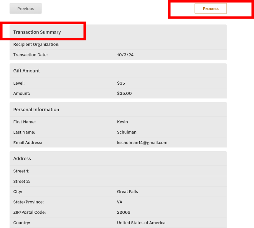
Kevin
2 responses to “Walk A Mile In Their Shoes”
Behavioral Science Q & A
Thanks so much for raising this. Yes, capturing donor information can be helpful for stewardship like newsletters, thank-you letters, impact updates. But how you ask matters. Forcing full data capture introduces friction that can significantly depress conversion, many donors may simply abandon the process. Beyond the friction itself, required fields also shift the emotional experience […]
Read Full Answer
Unlike holidays that everyone already knows, Giving Tuesday is a created event. Many donors recognize the name but not the exact timing, so referencing it becomes a helpful cue. It serves as a reminder and taps into social norm activation (“everyone’s giving today”), which boosts response. However, we still want it paired with the mission, […]
Read Full Answer
When a subject line leads with the match (“Your gift matched!”), it risks triggering market-norm thinking: the sense that giving is a financial transaction rather than an act rooted in values, identity, and care. This shift reduces intrinsic motivation and, over time, can weaken donor satisfaction and long-term engagement. It also makes the email indistinguishable […]
Read Full Answer
There’s no evidence that QR codes suppress mid-value giving; all available research suggests they either help or have no negative effect. In fact, behavioral and usability research consistently shows the opposite: reducing friction at any point in the donation process increases completion rates and total response. And that has nothing to do with capacity and […]
Read Full Answer
What you’re experiencing is very common. Resistance often isn’t about capability, but about motivation quality. If board members feel pushed into fundraising, that triggers controlled motivation (low quality motivation) i.e. obligation, guilt, or fear of judgment, which often results in avoidance. Instead, we need to create conditions for volitional motivation (high quality motivation) by satisfying […]
Read Full Answer
That’s a really thoughtful question, and you’re not the first to raise it. Many of our clients have been cautious about placing the ask at the very end. To address their concern, we’ve tested both approaches, and the results are clear: when the ask comes last, even if that means it appears on the second […]
Read Full Answer
how about looking at some of the new forms?
Erica, that was my commentary about the multi-step vs. single scroll form. Many (most?) of the new forms are multi-step and routinely lose in head to head testing with a single scroll form. Did you have something else in mind? we do behavioral science audits of check out forms and processes as a regular part of our agency services – identifying testing opportunities and then executing them. Happy to share details if interested.