We Don’t Write So Good. And How to Easily Fix It
This is the cover page of the co-branded, jointly produced report on the state of email copy from NextAfter and DonorVoice.
In this case, you can judge the book by its cover. It’s a large email sample and the report is visually appealing, easy to read and easy to find nuggets of goodness.

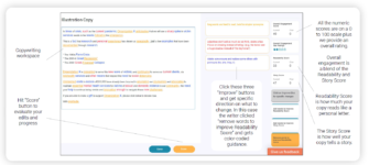
One of the main analytical tools used was Copy Optimizer. Sign up for your low cost, no contract subscription here.
The 2,000 emails covered 8 verticals and 80 organizations and including a mix of fundraising and engagement content.
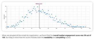
Our sector’s storytelling is still the weak link in copy. The average score is a mere 28 out of 100. The sector does better on Readability, scoring 50 out of 100.
But, unicorns exist that score well on both. This is a distribution plot of Engagement Scores and you can see a lot of variance in our 2,000 email sample. The ones on the far right are doing well on Story and Readability. ( Note: The lower the score the better.)

Your copy can join those on the far right of the graph, one of those lovely blue dots scoring high on Readability and Story and Overall Engagement. A five star review is within your grasp.
It just requires a different set of flashlights highlighting where copy is off the mark and illuminating your path to fixing with easy to follow guidance. You can get that here.

Kevin
P.S. You can download the report for free, here.


