What Images to Use in Fundraising?
Any answer to this question should start with ‘it depends’. What follows should include,
-
- Some theory or evidence on what makes images different and
- Theory or evidence on what makes people who are looking at the images different and
- the interplay between the two.
However, most answers to this question include pontificating about #1 only, what makes images different. For example, use sad kids or happy kids or a single child or use happy images for happy copy and sad images for sad copy.
All of these answers are woefully incomplete yet 99% of fundraising ‘experts’ will have some version of a ‘what makes images different’ answer. Too many ‘experts’ force fundraising to be the one thing it oughtn’t be – one size fits all.
The people looking at the images are different too. They have different Identities. Parents might want to see children with adults to better match their view of themselves with that of the beneficiary.
People also have different Personalities. People high in Conscientiousness will appreciate seeing the beneficiary making an effort to better themselves while those high in Agreeableness might want to see a more sympathetic portrayal.
Researchers in a study looking at Syrian refugees developed a theory of those images shown by this continuum. Images with a child showing some level of distress is creating a sense of high vulnerability and need. On the other end, an image of an adult in no obvious distress creates far less need because the person seems far less vulnerable.

In the experiments they found very little support for their image theory. Kids are slightly more likely to invoke a sense of empathy and compassion compared to adults but this effect explains very little of giving, almost none.
How can this be? 9.5 out of 10 dentists or fundraising experts would tell us kids work better than adults.
Fortunately these researchers didn’t just have an image theory, they also had a theory of how the people looking at the images are different.
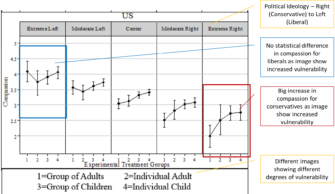
They theorized that conservative, right leaning people would be influenced by seeing high vulnerability in images while liberal, left leaning people would feel equal levels of compassion and desire to help regardless of the image.
They were right. The level of vulnerability shown in the image had a big effect on Conservatives and none on Liberals. Liberals are more likely to feel compassion than Conservatives in general and that level of Compassion is unaffected by image selection.
Conservatives level of compassion and desire to help is heavily influenced by image selection with a child in distress greatly increasing their compassion, empathy and helping behavior. This is showing US results but the exact same thing was found in Sweden and the UK.

Image selection matters but only in the context of who is looking at the image. People are different.
It really isn’t hard to have different images going to different audiences. That it rarely happens in fundraising practice is the single biggest barrier to growth and maximum return on investment.
We have to deliver value to get value. And in what should be obvious but seemingly isn’t, people value different things.
Kevin
P.S. If your child image beat your adult image and you did a one-size-fits-all test it’s quite possible it’s because of the idiosyncrasies of your image selection rather than a generalizable finding.


hi, thanks for all you do.
I would love it if you were to show some actual response testing, what have you seen?
We all know that sometimes what donors say and what they do is different. What evokes a higher response typically also makes some other people uncomfortable… this is where the flow of communication is so important. Sad pictures in the appeals, happy pictures in the newsletters reporting back for example…
Hi Erica, thanks for the comments and feedback. I’d challenge you and us to think differently about the solution to your valid point of making some people uncomfortable while getting others to respond. The switching of happy to sad by communication type still leaves some people uncomfortable at each turn. The better option is two versions (as starting point) of the appeal, each going to different people grouped together in a way that reduces the chance of either group being uncomfortable.