When a Color Test Isn’t a Waste of Time
The brown kraft envelope versus the white one. I’ll never forget when I was indirectly involved with this test, in part because I had to google ‘brown kraft’ having no clue what the hell color or shape that might take.
The other reason is it struck me as incredibly random. Why this test? If it marginally won/lost isn’t it likely that difference is random noise? If it marginally won/lost is that because some people who got it love brown kraft and others, not so much?
In short, there was no theory or rationale for the test. It could have been any color or shape versus any other. All of which effectively invokes what I refer to as the “infinity problem” where random ideas are ubiquitous and equal in their merit or lack thereof.
So when is a color test not a waste of time?
It’s a bit of a trick question in that the answer is the same for color as for any other test. It’s a waste of time (and money) if there is no evidence or theory behind it – i.e. no reason to believe.
Here is a useful, materially important color test that you can apply tomorrow. But, the real value in sharing these results is the thinking that went into it. Thus, the real takeaway that will deliver far bigger impact for your charity is borrowing/stealing/replicating the process, thinking and methodology, not the specific finding.
The test started with desk research on color theory and positive or negatively framed appeals.
- We know colors tend to be perceived as warm or cold.
- We also know there is evidence for positively and negatively framed appeals “working” and that it often depends on other factors.
- One of those factors is the degree of consistency among the copy and imagery. Sad copy and a happy image violate this aim for consistency, which creates some degree of mental angst and suppressed response.
- But, there is other evidence that some incongruence can increase attention. I want things to look familiar but if I’m trying to break someone out of a behavioral rut I also need a degree of novelty or newness, something to ‘shock’ them out of their typical behavior – e.g. throwing the appeal away.
This testing combined some of these evidence-based ideas and formed two hypotheses. Think of a hypothesis as you (or your agency) having skin in the game, some claim for what will happen.
Demand More Rigor In Testing
If you can’t make a wager on the outcome and feel good about your bet then that’s a very good indicator that the test is random and has zero evidence behind it. Your organization’s mission should demand more rigor in testing, lots of money that could go to the cause is being wasted otherwise.
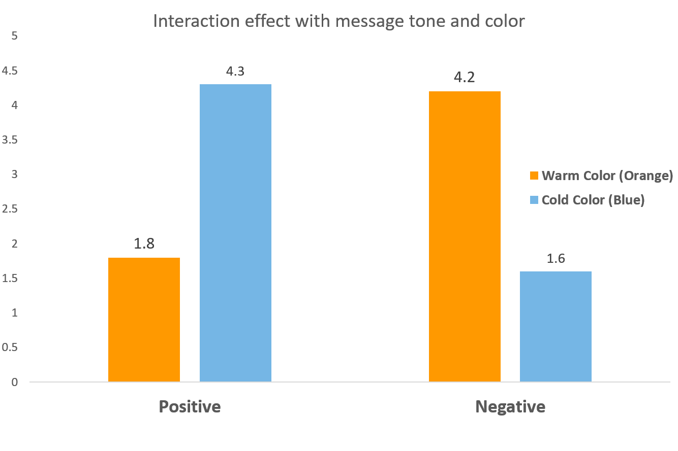
Hypothesis One: A positively (negatively) framed appeal with a blue (orange) background will get a higher response rate than a positively (negatively) framed one with an orange (blue) one.
Reason to believe: the incongruence of warm (cold) with negative (positive) will generate more attention and thus, more response.
The first experiment used Save the Children appeals and changed the background color. The hypothesis is supported, there is a relationship between color and tone of appeal and this shows that having those in mental conflict with each other (positive with cold, negative with warm) does increase the amount of attention and by extension, giving.

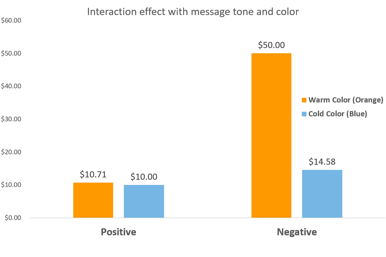
The second experiment was a field test with Salvation Army using an e-newsletter with the same 2×2 design of appeal valence and color. There is partial support for the hypothesis, which led the researchers to dig in on explanations for why the positive appeal showed no interaction with color. Fortunately, the researchers had included pre and post test survey measures and as it turns out, the image and copy used for the positive appeal was too positive and scored very low on the perceived need for help. If the perception is that the person doesn’t need help then picking the right Pantone becomes irrelevant.

The process and design (2×2) with pre/post survey measures (to affirm cause and effect) and upfront think time with an official, stated “bet” on the outcome is the winning formula here, not orange/blue whatevers…
Kevin


Hi Kevin, just as a yellow carrier test was not random back in the day – because folks associated yellow with telegrams and urgency – brown kraft testing was done because that was a stock associated with official or important correspondence. I agree there is a lot of random testing (and as a production guy now instead of an agency one, I tend to look at these as just increasing costs for seemingly no good reason), but those two carrier tests often produced noticeably higher response rates, depending on what was being sent. May be passe now but very definitely reasoned back then! Thanks.
Hi Chip and thanks for reading and commenting. No doubt there is an explanation or rationale for some testing, maybe much of it.
What we’d argue is digging deeper than the idea of official correspondence being associated with Color/format X. The next question is why might being more official matter? And is more official good for everyone or just some people and why?
For example, people high in Conscientiousness (personality trait, which we can target using 3rd party data) might be more inclined to open something that looks official while those lower in this trait, not so much.
And does the fact that people quickly discover it’s a charity appeal vs. official correspondence reduce one’s sense of competence and make them less likely to give in the future?
Testing needs to show why something worked or didn’t, not just that it did/didn’t.
More upfront thinking and fewer tests is a natural outcome of adding more rigor and value to our testing by putting more burden on our test ideas to be worth the time and money.
Learning something about the why of behavior has application beyond the single test since the single test wasn’t about brown kraft, merely using brown kraft as one way (among many) to test the larger idea.