

Definitely Bold and Underline Fundraising Copy, Right?
There seems to be an article of faith in direct mail fundraising: bold and underline the important stuff.
Do a Google search for fundraising copywriting advice and some version of the same rationale appears again and again.
-
- People don’t really read fundraising letters.
- They skim them.
- So bolding and underlining tell the donor what matters and, more importantly, help us decide which bits they are most likely to notice.
Then come the rules. Don’t use too much or too little, emphasize the need and/or the ask and make sure you bold this sentence but not that one.
All of which assumes something that rarely gets questioned: people are inevitably going to skim.
Are they?
People certainly skim things they don’t much care about. But do they skim a letter they actually want to read? A note that feels personal? A story that pulls them along?
There’s at least another possibility worth considering. Maybe donors don’t skim despite all our bolding, underlining, boxes, arrows, Johnson boxes, PSs and other devices designed to accommodate skimming. Maybe some of that stuff helps teach them that the letter itself isn’t worth reading closely.
That’s a different problem and one where evidence would be useful, because “fundraising best practice” has an unfortunate habit of becoming accepted wisdom long before anyone bothers asking whether it works.
There is a decent academic literature on what researchers call text enhancement, particularly with ESL students. Researchers have experimented with bolding, underlining and other ways of making parts of text more visually salient in the hope of improving attention, comprehension and recall.
The findings are spectacularly unspectacular. Sometimes enhancement helps a little, sometimes not at all. Granted, learning a second language is not fundraising. So I went looking for actual fundraising experiments.
Surely someone has tested this? Researchers have managed to study whether ducks produce echoes and whether giving cows names affects milk production. Bolding a fundraising letter seems comparatively accessible.
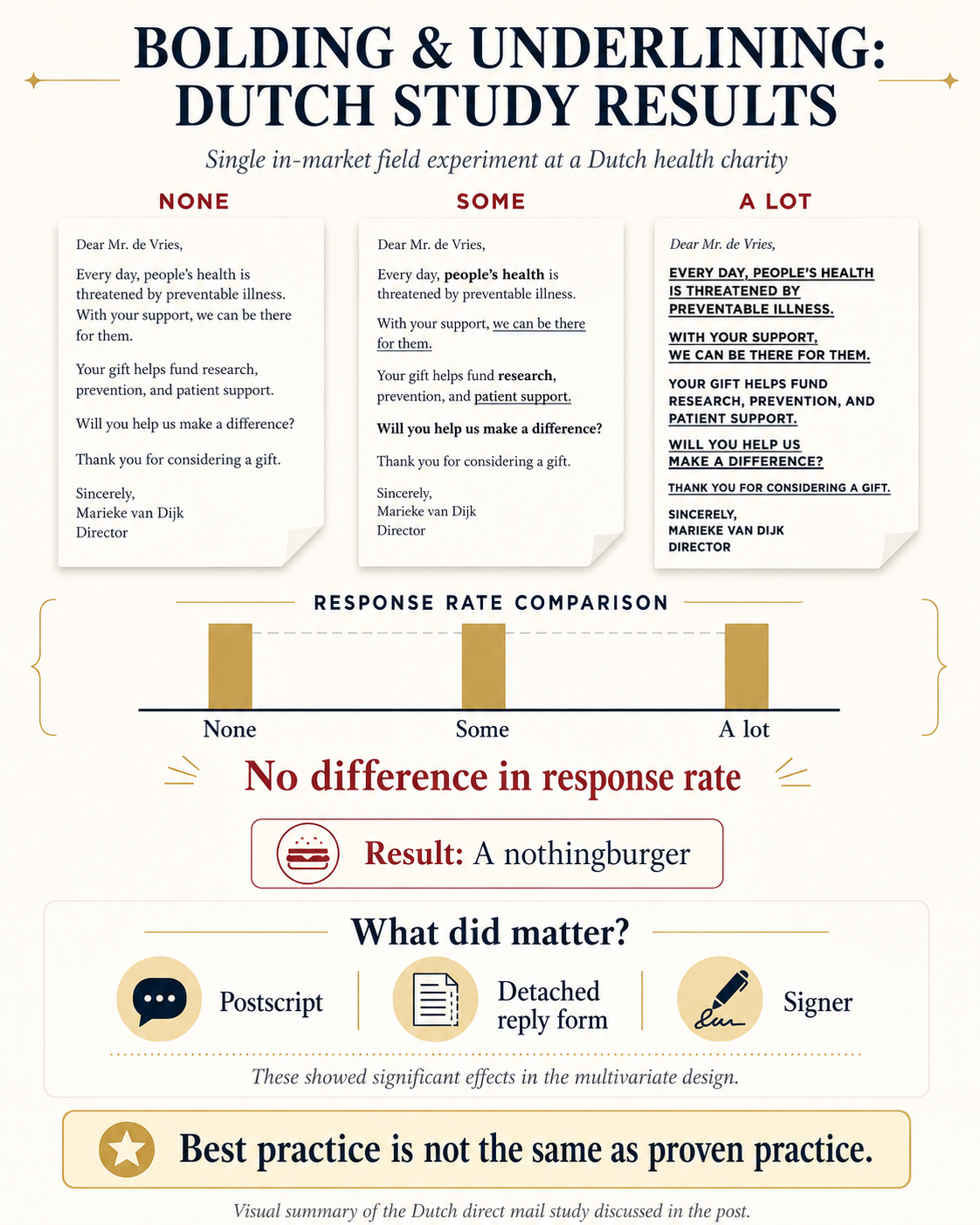
I found one field experiment involving a Dutch health charity that tested different amounts of bolding and underlining in an actual fundraising appeal. The result: no meaningful difference in response rate.
That alone doesn’t prove bolding and underlining never matter. One experiment is one experiment.
But there’s an interesting wrinkle. The researchers tested several other letter characteristics at the same time. The postscript mattered. A detached reply form mattered. The identity of the signer mattered.
In other words, their experiment was perfectly capable of detecting effects. Bolding and underlining simply wasn’t one of them.
Perhaps there is a Goldilocks version we haven’t found yet, with exactly the right number of underlines applied to exactly the right words. Perhaps it helps in some circumstances and not others. But that is a very different claim from calling it a best practice.
“Best practice” ought to mean we have some decent reason to believe a practice is better, otherwise it’s just a habit with good PR.
Kevin
12 responses to “Definitely Bold and Underline Fundraising Copy, Right?”
Behavioral Science Q & A
Thanks so much for raising this. Yes, capturing donor information can be helpful for stewardship like newsletters, thank-you letters, impact updates. But how you ask matters. Forcing full data capture introduces friction that can significantly depress conversion, many donors may simply abandon the process. Beyond the friction itself, required fields also shift the emotional experience […]
Read Full Answer
Unlike holidays that everyone already knows, Giving Tuesday is a created event. Many donors recognize the name but not the exact timing, so referencing it becomes a helpful cue. It serves as a reminder and taps into social norm activation (“everyone’s giving today”), which boosts response. However, we still want it paired with the mission, […]
Read Full Answer
When a subject line leads with the match (“Your gift matched!”), it risks triggering market-norm thinking: the sense that giving is a financial transaction rather than an act rooted in values, identity, and care. This shift reduces intrinsic motivation and, over time, can weaken donor satisfaction and long-term engagement. It also makes the email indistinguishable […]
Read Full Answer
There’s no evidence that QR codes suppress mid-value giving; all available research suggests they either help or have no negative effect. In fact, behavioral and usability research consistently shows the opposite: reducing friction at any point in the donation process increases completion rates and total response. And that has nothing to do with capacity and […]
Read Full Answer
What you’re experiencing is very common. Resistance often isn’t about capability, but about motivation quality. If board members feel pushed into fundraising, that triggers controlled motivation (low quality motivation) i.e. obligation, guilt, or fear of judgment, which often results in avoidance. Instead, we need to create conditions for volitional motivation (high quality motivation) by satisfying […]
Read Full Answer
That’s a really thoughtful question, and you’re not the first to raise it. Many of our clients have been cautious about placing the ask at the very end. To address their concern, we’ve tested both approaches, and the results are clear: when the ask comes last, even if that means it appears on the second […]
Read Full Answer
hi, actually, this has been tested and scientifically researched. The great Siegfried Vogele and his institute looked at how people read. The underlining and bolding helped create the S-curve to provide people the most important information when they first skim the letter. They look at the signer, the ps, these major points before they decide if they want to read the letter word for word. You can check out more here. https://sofii.org/article/secrets-of-direct-mail-1-professor-siegfried-vogele
I’ve had the pleasure of attending his two day workshop at my first job at Reader’s Digest many many years ago now but over my 44 years of direct mail experience, this was and continues to be a proven approach. Just like indentation, p.s. and type size. People are people and if nothing else with the many additional channels, people skim even more so we have to make it easy for them to find the most important stuff in your appeals especially the CALL to action. Let’s focus on how we can improve from there!
yes, very familiar with Vogele but the “best practice” that gets tossed about is not what Vögele found.
His eye-camera work was about how people initially orient themselves to a letter. Before deciding whether to read it, they scan for signals that help answer some pretty obvious questions: Who is this from? Is it for me? What is it about? Is this relevant or worth my attention? Things such as the recipient’s name, the signature, a headline, an image or another visually distinctive element can attract a fixation during that initial scan. That is a finding about where attention goes.
There is nothing from Vogele directly calling this an “S-curve,” and certainly nothing showing that bolding and underlining “create” one. More importantly, there is a huge leap from “a visually distinctive element can attract the eye” to “therefore we should scatter bolding and underlining throughout fundraising copy,” followed by an even bigger leap to “and doing that increases response.” Eye tracking cannot establish the latter. Looking and giving are different dependent variables.
And this is where the actual fundraising experiment that I cited is particularly interesting. They found that the optimal letter contained no typographic amplifiers such as bold print. Yet the identity of the signer did matter: having a professor in health-care research sign the letter increased donations by 2.4%.
That result actually makes sense in light of Vögele’s useful observation. If I’m rapidly deciding who this is from, whether it is credible or relevant, and whether I should bother reading, who signed it contains information that helps me make that decision. Randomly bolding “YOUR GIFT TODAY” or underlining half a sentence does not necessarily tell me anything useful. At some point, all those visual “signals” simply become more stuff competing for attention.
So Vögele’s work doesn’t establish the fundraising “best practice” being defended here. Quite the opposite, it shows how a sensible observation about initial attention can get turned into a crude executional rule and then repeated until people start calling the rule “scientifically proven.” Vögele and Bidmon themselves later noted that the scientific ideas behind the Dialogue Method had been simplified for seminar use. This looks like a pretty good example of what another few decades of simplification can produce.
It would be helpful to have the reference to that Dutch study so we could go read it. Very interested in learning more about the PS, the signer, and the seperate reply card elements of the study.
I’ll note that what they chose to underline in the Some treatment isn’t what most of us would choose to underline.
Surprising that the A Lot treatment didn’t do worse, all caps body text is proven to reduce comprehension (Calvin Wheidon’s research).
But the text of their appeal I would rate as a very poor writing, it’s also very short, so that scanning probably isn’t a factor like it is with a 2 page or longer letter. And maybe this is one of those on-line experiments where the subjects are convenience recruites from MechanicalTurk, or colleges students.
Hi Gary,
it was real humans, donors – not college students (who are still human by all accounts) or M-turk. the visual was simply an AI rendition to illustrate the idea, it was not the actual letter or typographics. Vriens, M., van der Scheer, H. R., Hoekstra, J. C., & Bult, J. R. (1998). “Conjoint experiments for direct mail response optimization.” European Journal of Marketing, 32(3/4), 323–339. DOI:
it was a sophisticated factorial design, they varied several mailing characteristics simultaneously across 16 versions with these letter/package attributes:
-payment mechanism attached versus unattached
-brochure present versus absent
-illustration on the letter at right, left, or none
-amount of information underlined: much, little, or none
-P.S. containing a summary versus new information
-signature from a professor versus the organization’s director
-placement of the address
What nobody defending the ‘status quo’ of underline and bold seems to possess is a test showing that it actually lifts response vs. none. I found one such experiment and the answer is no, it does not. This idea of underline/bold has just been passed down as article of faith. Maybe it was Commandment 11 and I missed it.
The “I’ve been doing this a long time and we know it works” reason feels pretty thin to me.
Thanks for the reference Kevin, I’ll check it out.
A study was done in the mid-nineties on how typography affects readability and comprehension. It was published as a book. The study showed that bold and italicized type reduces comprehension. Underlining not so much. The study also showed that layout has a profound effect on whether someone even reads the content.
This book will challenge your beliefs on typography and layout.
Here’s the info for the book:
Type & Layout • How typography and design can get your message across — or get in the way.
Colin Wheildon
Strathmoor Press
Berkley, California
ISBN #: 0-9624891-5-8
Ken,
Thanks for the read and comment and sourcing. Yes, if Content is King, then Context is at least Queen. layout and design have huge influence on whether people read or not and that is as true for direct mail as it is a web page or a landing form.
Underlining was was probably inherited from the sales letters of the 70s. I no longer have my original Mal Warwick text, but Steven Hitchcock promotes underlining in his book Open Immediately! (pg 164, 2004) without evidence but supported by the scanning arguement. In their 2023 book Writing for Busy Readers, Rogers and Lasky-Fink of Harvard’s JFK School of Government report on on-line studies they conducted (pg 134-135) that show highlighting, underlining and bolding can “increae the likelihood that reader reads the formatted words, but they can decrease the reading of eveything else.” I’ll be looking around for more evidence; as you say, this might be received wisdom that needs rethinking.
Hi Gary, thanks for that extra digging and sharing. One obvious note on online that likely makes it very different from print, the context of underline and bold is a necessary cue for clicking behavior. So I am often very drawn to those visual cues to achieve my “job” on the page. On the flip side, if I encounter bold/underline online and I can’t click I might be confused or frustrated.
I loaned my Wheildon to a designer, but never got it back. He probably burned it in protest.
SAME 😂
Very interesting discussion. Thank you. to me, much of this is about relationships and now sounding “shrill.” The call-to-action mantra is getting tired and people are getting tired of it. Thus, having time in the sequencing of letters/mail to donors to update them personally, with NO ask, and with notes and “wet” signatures seems to be foundational. Batching mailings so this is possible, and rethinking mass mailings, will help with crediblity. There’s lots of chatter around “smaller” level donors dropping out. Some may be the tax incentives don’t work so well for them. Other things could be simply that they are tired of getting “spammed” and “hammered”–and are throwing out meaningless shrill fundraising materials. What I’m seeing is that investing in “small level” donors means that they re-engage and often consider more transformative gifts in the future.