The Charity Image That Quietly Signals Agency
Same hands, same object being transferred, same charitable context; just a small shift in vertical position.
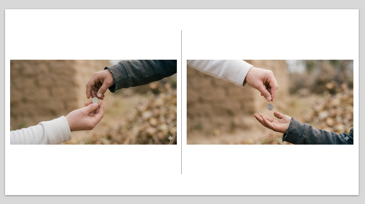
On the left, the donor’s hand sits below the recipient’s, on the right, it’s above.
Donors donated more in a split test when the donor’s hand appeared higher in the frame. The reason is straightforward, humans interpret vertical space as hierarchy and higher implies agency. And donors want to feel choiceful and in control of the giving decision. Note, these associations operate quickly and automatically, long before anyone consciously evaluates the message.
The visual structure with donor hand on top reinforces the same message the appeal is making (i.e. donate to help), the brain processes the information more easily, and messages that are easier to process tend to feel more persuasive.
None of this has anything to do with program effectiveness, organizational efficiency, or impact. The only thing that changed was the height of a hand in a photograph.
Kevin
One response to “The Charity Image That Quietly Signals Agency”
Behavioral Science Q & A
Thanks so much for raising this. Yes, capturing donor information can be helpful for stewardship like newsletters, thank-you letters, impact updates. But how you ask matters. Forcing full data capture introduces friction that can significantly depress conversion, many donors may simply abandon the process. Beyond the friction itself, required fields also shift the emotional experience […]
Read Full Answer
Unlike holidays that everyone already knows, Giving Tuesday is a created event. Many donors recognize the name but not the exact timing, so referencing it becomes a helpful cue. It serves as a reminder and taps into social norm activation (“everyone’s giving today”), which boosts response. However, we still want it paired with the mission, […]
Read Full Answer
When a subject line leads with the match (“Your gift matched!”), it risks triggering market-norm thinking: the sense that giving is a financial transaction rather than an act rooted in values, identity, and care. This shift reduces intrinsic motivation and, over time, can weaken donor satisfaction and long-term engagement. It also makes the email indistinguishable […]
Read Full Answer
There’s no evidence that QR codes suppress mid-value giving; all available research suggests they either help or have no negative effect. In fact, behavioral and usability research consistently shows the opposite: reducing friction at any point in the donation process increases completion rates and total response. And that has nothing to do with capacity and […]
Read Full Answer
What you’re experiencing is very common. Resistance often isn’t about capability, but about motivation quality. If board members feel pushed into fundraising, that triggers controlled motivation (low quality motivation) i.e. obligation, guilt, or fear of judgment, which often results in avoidance. Instead, we need to create conditions for volitional motivation (high quality motivation) by satisfying […]
Read Full Answer
That’s a really thoughtful question, and you’re not the first to raise it. Many of our clients have been cautious about placing the ask at the very end. To address their concern, we’ve tested both approaches, and the results are clear: when the ask comes last, even if that means it appears on the second […]
Read Full Answer
Ooh, good one. Hierarchy, visual. Fully adopted. From Ye Olde Curiosity Shoppe: Wonder why the shirts are different colors. There’s more tension in the right photo, seems to me; because the coin is suspended in air. Also the photo on the right completes the viewing arc successfully, the eye exiting on the right, down the dark sleeve and out; whereas the left photo takes the eye out on the lower left corner, which feels awkward to my brain. Anyhoo… As ever, thank you for these actionable morsels.